Interactive Charts
Why charts?
One of our problems in content analysis is an unhealthy attachment to spreadsheets. Although you can export the manifest of all content (including all decisions and additional data that you have added in your analysis), in Content Chimera this is really an export step to hand off to those that will be executing on content transformation.
Spreadsheets do not allow you to easily see patterns. Charts are better at communicating patterns of sites and content, especially for business stakeholders.
Why interactive charts?
Interactive charts allow you to:
Define and modify your own charts.
Automatically update when the underlying data changes.
Chart arbitrary data you have imported or scraped.
Randomly sample the underlying data.
Fundamentally there are two reasons for interactive charts:
For your content analysis, to do custom analysis. After all, every site is different.
To facilitate interactive discussions with stakeholders
Things to keep in mind when charting
There are really two phases of charting:
Exploring the content through charting.
Communicating about content to ensure people understand the content situation, to compel them to take action, or to engage in a discussion of how to move forward.
Of course these are also iterative and there is interplay between the two, but fundamentally make sure that when you are communicating that you want to be very deliberate about your charting. We’ve attempted to build in chart types (and default charts) that are effective toward communication and engagement, but when building your charts for communication keep the following in mind:
Be clear in what you are attempting to communicate. We don’t want to overwhelm folks with charts, but isolate what we need.
In general, use the simplest chart possible. For instance, if a bar chart can do the job, then use a bar chart.
Only add color for a very specific reason, and not just for decoration. When you do add colors, Content Chimera attempts to use the same colors for the same values across charts.
We include pie charts since they are used so often, but really only use them if you are trying to communicate that one value is dominant.
Charting basics in Content Chimera
The Assets & Metadata page (go there) is where you will play with and build charts, since it is the center for exploring your content. You will see a pulldown for default charts as well as charts you have defined. Selecting from this pulldown will load the page with that chart.
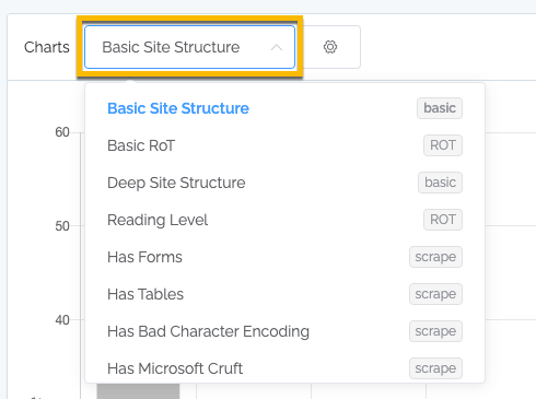
Next to each chart name you will see basic, scrape, or ROT. Basic are charts that you can always see. The others require a specific ROT analysis or scrape to happen before you can see them.
Random sampling
In virtually all charts, you can click on any section of the chart to see a sample of the underlying data. For instance, in this example we click on the “deals” bar that represents over a thousand URLs, and we see a random sample of ten of those pages:
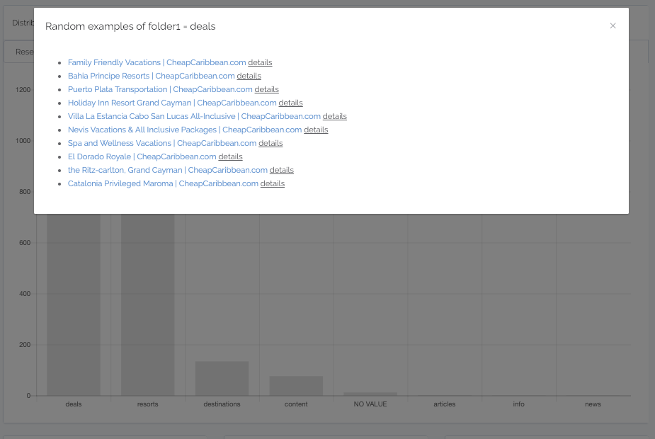
Every time we click on the bar, we will see a new sample.
There are several advantages to randomly sample, with the most significant being that we can see different “eras” of content within that bar. In addition, we can quality check our work with random sampling.
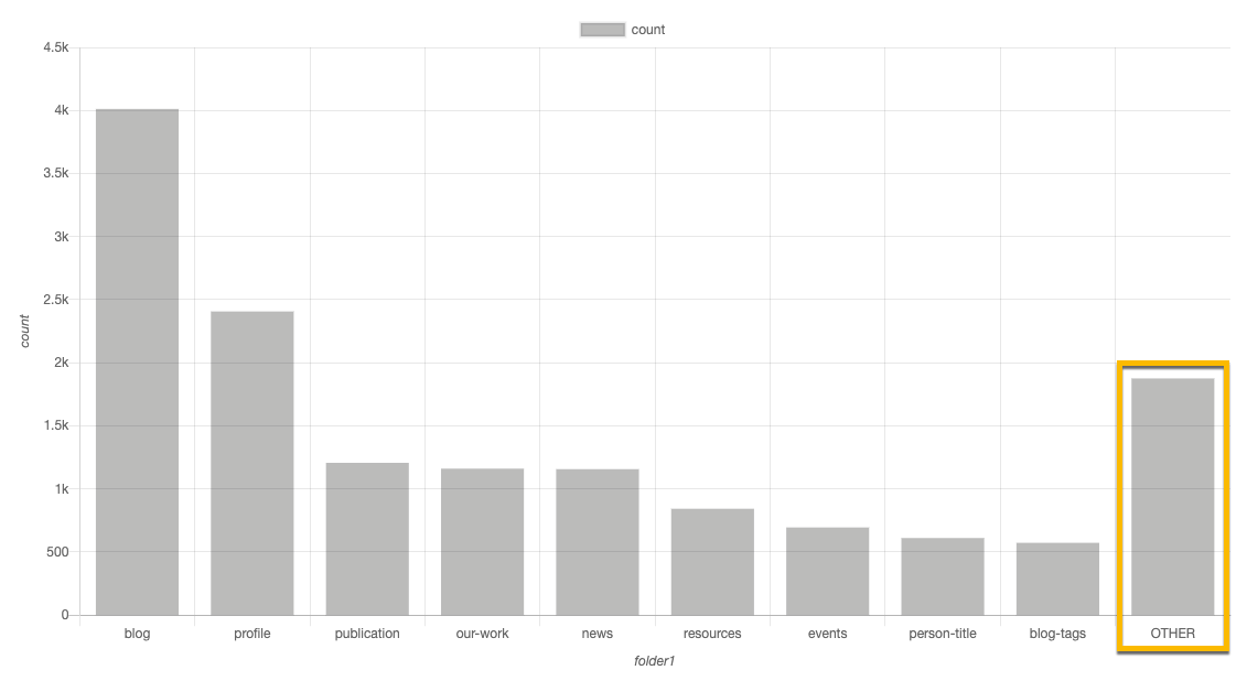
“OTHER”
In our content analysis, in at least the initial analysis, we need to understand the big picture. We probably do not care as much about the “long tail”. Normal graphing tools will provide us with charts that dominate that long tail.
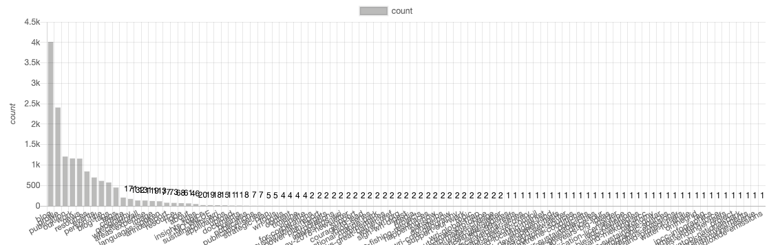
But Content Chimera by default will summarize all the long tail items into an “OTHER”, which is a far simpler graph to dive into.
Dates, numbers, and auto-binning
In general we are looking for patterns. We specifically do not want to devolve to charts with tons of bars, which is the default view that normal charting tools will provide. For instance, here is a chart (for another site) where we set “Distribution of” to the date and set the bars to 20 (a maximum of 20 bars):
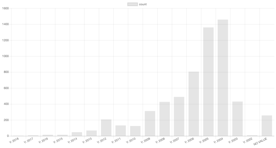
We did not tell it to group by years (of course the actual dates are year/month/date). It happened automatically.
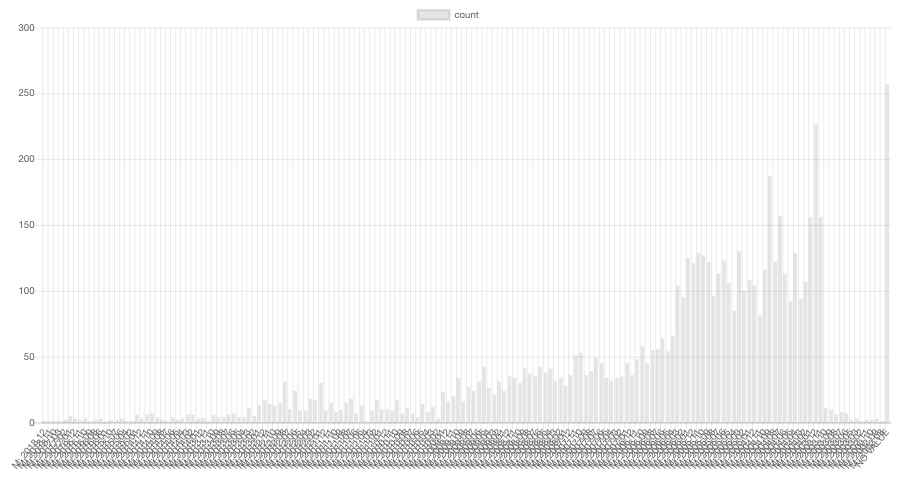
When we set it to a maximum of a thousand we get this (grouped by month):
For binning by date to work, the field must be stored as a date. Right now this happens automatically in the date field (pulling from the meta tags, if they are set), but this date is often more of a system date (when it was last cached or something like that). You can also scrape off dates (which the above example used), in which case you have to indicate you are scraping a date for the binning to happen correctly.
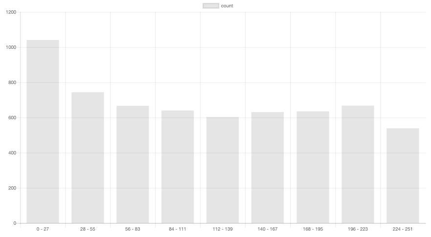
This will also happen for numbers (to be more precise, integers) — this is looking at the maximum depth of the content (this site has extremely deep content!):
Fundamentally, if there are enough bars to accommodate the actual values, then Content Chimera will not bin. If they won’t fit, then it will bin.
Advanced charting
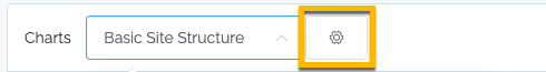
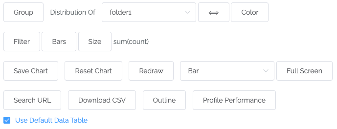
As with many places in Content Chimera, access the advanced settings for charting via the gear icon. In this case, the gear icon is next to the chart pulldown (these are the bar chart options):
You will then see the charting options:
Note that the labels and options will change based on the chart type. For example, these are the scatter chart options:
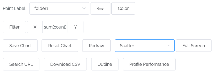
In general, the tool attempts to carry over settings from one chart type to another as you explore methods of best expressing the point you are trying to make or understand about the content.
This is a description of each option for charting (the description is for bar charts — for treemaps, see the section above):
Distribution of. This is the primary field that we are charting in the default bar chart.
Two-way arrow. This is to switch “Distribution of” and “Color” fields.
Color. How bars will be segmented and colored.
Filter. How to filter the chart (what content to include in the chart).
Group. How to group the bars.
Bars. How many bars there are.
Size. The default is the count (of de-duplicated assets). There are two components of sizing: the aggregate function (sum and average are the options) and the field that’s being used for the numeric value. For instance, you could chart size by word count or pageviews. It just needs to be a number.
Switch chart type. Switch between bar and treemap.
Text size (treemap only). Change the text size.
Reset chart. Go back to all defaults (folder1, bar chart, ten bars).
Switch orientation. Switch between the bars being horizontal and vertical.
Search URL. This isn’t actually a graphing thing, but sometimes you want to see what Content Chimera has captured for a particular URL.
Download CSV. Download a CSV that represents what is being graphed (not the raw data, but a summary view roughly correlating with what is visually represented).
Full Screen. Show just the graph on you full screen (there is an unresolved issue when you have monitors of different dimensions and pixel densities, so you may not get absolute full screen).
